violinplot
Makes a violin plot of all numerical features against a specified categorical target column.
Description
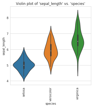
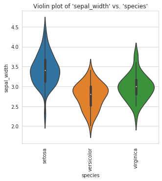
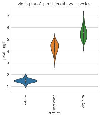
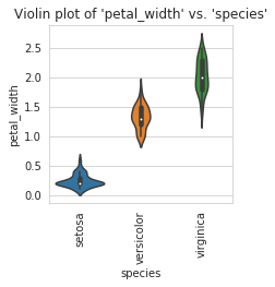
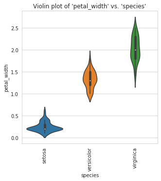
A violin plot plays a similar role as a box and whisker plot. It shows the distribution of quantitative data across several levels of one (or more) categorical variables such that those distributions can be compared. Unlike a box plot, in which all of the plot components correspond to actual data points, the violin plot features a kernel density estimation of the underlying distribution.
Examples
We are using the classic iris data set and a Jupyter notebook in the following examples.
Violinplots can be created for every column in a DataFrame and separated by a specified target:
violinplot can be created for specified columns only:
The size of plots can changed using the fig_size parameter
To save a figure to the current working directory, set the save_fig parameter to True:
To improve this documentation, visit the datasist-doc repository
Last updated